New Animated Title Designs for KQEK.com’s podcasts (2014)
After upgrading KQEK.com’s website from an olde HTML site to a fancy-schmancy WordPress theme with a new logo, it made sense to extend the branding of the site (and my for-hire skills) to the latest wave of podcasts for 2014, and although it’s been in the planning stages for a while, I finally finished up on redesigning the intros for the site’s podcasts from a static title card with the old logo to something more animated (and maybe a little trippy).
The idea was to take the new logo – basically the old logo superimposed on the round-cornered screen of a static-laden CRT tube set – and do something fun with it, using a bit of analogue and some digital fiddling to create something that’s again within that analogue-digital border I like so much.
The current logo was created by filming off a 1981 JVC TV set that’s the last remnant of a ¾” U-Matic edit suite I bought from a used car salesman-type back in 1992-ish (“used car salesman” is code for “crook”) and a small Canon digital camera, the SX220-SX PowerShot that takes great pictures but is hampered by Canon’s decision to discontinue OEM batteries. (Meaning, in most cases the economical solution is to buy functional 3rd party batteries that lose the ability to retain a charge after 2 months of normal usage. Thanks a lot, Canon.)
I ‘played’ the static logo on the TV and shot a few versions with differing contrast using the Canon. I then took separate snapshots of various TV snow and channel interference. In Photoshop, the logo + about 3 layers of static images were crunched together.
For the podcast’s Intro, things were done a little differently.
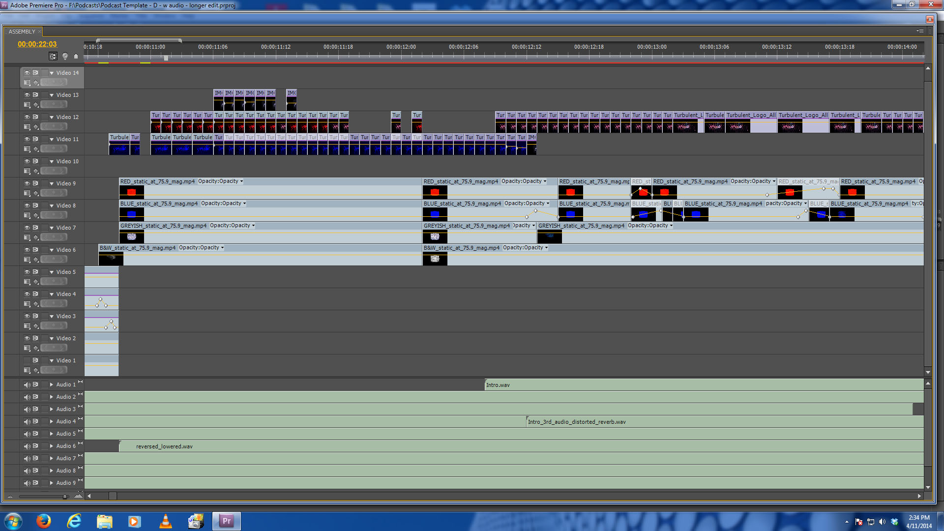
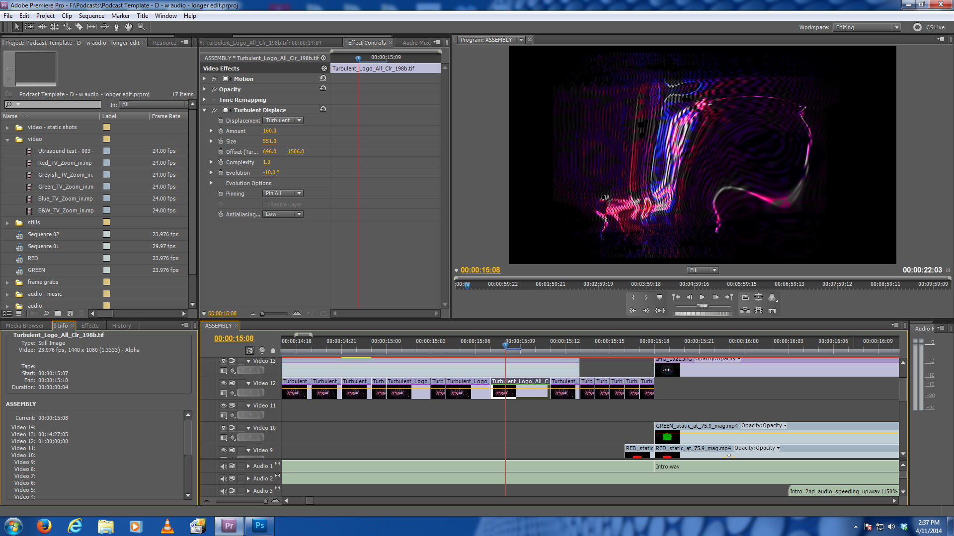
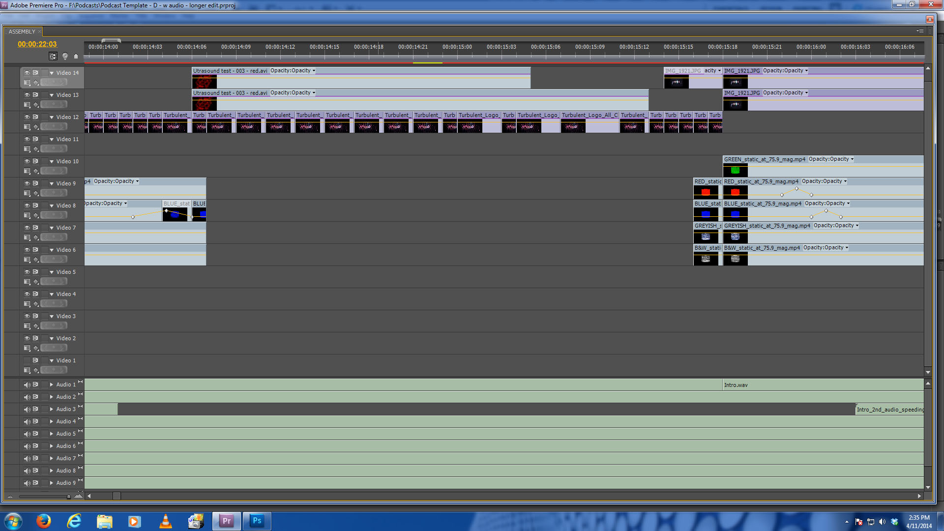
I shot about a half minute of TV snow with the Canon, making sure the centered logo took up maybe 50% of the frame. That footage was imported into Premiere, and I made five stems: the footage shot with the Canon in colour (let’s call it the ‘grey footage’); the same footage knocked down to B&W; and the same footage tinted red, green, and blue.
These five stems were imported into After Effects, where I made the TV screen zoom in from a pinprick to fill out the entire width of a 1080p screen. In Premiere, I imported the five zoom-in stems, fiddled with some contrasts, and stacked them on top of each other.
I also went through the original grey footage and made note of any red or blue flares that appeared in the flickering image. Any time they appeared – usually about 1-2 frames max , often at the corners, resembling a peeled page – I faded up either blue or red, saturating those brief frames with colour. Green was occasionally used, but just slightly.
The bottom track consisting of a B&W stem added extra contrast, so while fiddling with contrast and various types of layering, you could bring out certain levels of gritty waves and hidden patterns (some caused by the different frame rates between the Canon and the TV set).
That took care of the footage for zoom-ins.
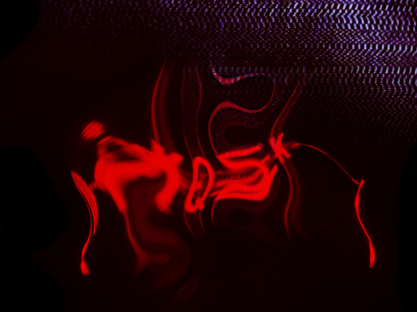
The central sections where the old KQEK logo appears to warp is really just a handful of stills making use of the logo in clean form, and the logo already warped. By re-applying a warping filter (Premiere’s Turbulent Displacement) on groups of 1, 2, and 3 frames, I made short bursts of motion, alternating between stills that were either full colour, red, or blue. Some of these were also stacked with different levels of superimpositions.
The first section, which looks as though the frozen face of a TV screen is melting under heat (kind of like an analogue version of a stuck film frame burning onscreen), was more or less made using the above filters et al.
The midsection kind of stacks everything with chunks of coloured frames interrupting the flow, under which I have the first test footage of the Big Head Amusement logo – the red splotch, as moving footage at a fixed point so it gives the midsection some momentum when warped by the Turbulent effect.
Now, I wanted to sneak in an element of the BHA logo because as my intro narration states, the podcast was created by BHA for the review site KQEK, so why not show that marriage of my two creative streams through a literal fusion of two logos, and using versions of those logos in their respective states of early development: BHA’s red splotch in its crudest form; and KQEK.com’s logo as its transitioning from clean and neat, to something under duress.
The third section reflects the KQEK logo after that state of duress: harsh, flaring from high contrast elements, and the texture of waves of TV snow as highlighted by fiddling with those stacked layers of the TV screen.
The Outro (closing credits) is somewhat made up of the TV snow material in reverse.
First there’s the blue snow which brings back the KQEK logo. Because the narration points out that I also hire out podcasting editing & mixing services at Mondomark.com (essentially my online C.V.), I thought about making a visual connection by bringing up my purple-faced avatar (itself derived from a JVC Newvicon camera whose ability to capture a stable image is adversely affected by a dying, hard-wired vewfinder) and have the snow bleed through the dark spots; and when I mention the MM website, I bring up the still for the Multimedia Skills & Services section so someone interested in these services knows where to look on the website for more samples & info. (I felt it looked more respectable that having a flashing mega-font of “Go here NOW!”)
As mentioned, the Outro’s last section is literally the zoom-in done in reverse, but like the Intro zoom-in, the two had to have proper timings, so I compressed their length in Premiere so there would be some pacing and balance with the other sections within the Intro / Outro.
Lastly, the audio.
I pre-recorded the narration, and in Premiere I did an assembly it to get an idea of the length for the full credits and figure out the Intro and Outro titles’ rough flow.
The background audio within the final mix is partially comprised of a small bit of voice from an interview. I picked a section where the interviewee’s voice has noticeable changes in pacing and emphasis in tones so there would be a similar aural variety to the sounds after I ‘treated’ them in Sony’s Sound Forge, which includes the voice played backward & slowed down; and massively saturated and knocked and blurred with small peaks of feedback.
I also treated some music by flipping its direction and treating it with an assortment of echo and EQ’ing. (The music is comprised of three types: I needed something tinny, something neutral, and something sharp and high so they could curl around the steady tone of my voice instead of fighting for space.)
I then went through each track, figuring out the proper dip times so there’s no obliteration of the narration; adjusted the volumes of each track, leaving the narration as clean and intelligible as possible; and decided which parts of the processed voice and music appeared over each other, or not at all.
That’s how the Intro & Outro sections were done.
So for those wanting to check out full HD versions (720p) of the aforementioned (plus the blue fuzz used as background textures for any stills), it’s on Vimeo:
Intro & Outro title designs for KQEK.com’s podcasts (2014) from Mark R. Hasan on Vimeo.
And on Big Head Amusement’s own YouTube channel:
To hear the full podcast with visuals, I uploaded a 480p version to KQEK.com’s YouTube channel:
And those wanting just the audio can hear the podcast at Libsyn:
Some might find this level of time and detail for credits a little insane… but I find it rather fun.
Cheers,
Mark R. Hasan, Editor
Big Head Amusements