Animation Extracts #01: Darius Holbert Podcast (May 2014)
As described in the prior making-of blog for the new Main / End Titles for the KQEK.com podcasts, I use animated textures to signal the switch from an ongoing interview to a music cue extract, and give the cue a bit more visual support than a blah black screen. For the latest podcast featuring composer Darius Holbert, I went a little farther in building the animations to match the dramatic or mood progressions in the cue extract.
More visual information within an .avi file will augment file size, and with 3 somewhat elaborate animated sequences, the final file is a bit meatier than expected – about 700 MB. The upload to KQEK.com’s YouTube channel took about 3-4 hours, and their conversion process to an .flv file did knock down some important details in one particularly elaborate section (comparative stills are at the end – but don’t jump ahead yet).
Of the three abstract graphics created to support the cue extracts in my interview with composer Darius Holbert, the finales of No. 2 and 3 lose the most in Vimeo and YouTube’s down-conversions, especially #3 because of the fine details in the patterns. The version uploaded to Vimeo fared better, but only in true 1080p do the details and colours look the most striking. The funny thing is, the concept for last graphic was pure accident.
Sort of.
Before I continue, if you haven’t watched the three graphics, do so now, because everything that follows will be total spoilers. I’ve larded the text with many big screen-sized frame grabs from the Premiere project timeline, plus some stills from an early draft of #3.
Within Animation Extracts #01, I re-ordered the extracted pieces (the order is 1, 3, 2 in the podcast) to build towards a specific mood (as reflected by the pretentious titles I gave each graphic).
Here are the links for the podcast on YouTube:
And the animation extracts on YouTube:
And higher quality version on Vimeo (true 720p):
As stated in the opening, I’ve larded the text below with a lot of stills from each of the 3 sequences, but if you don’t feel like reading, go ahead and jump to the pictures, but shoot to the end for my own reasons for like abstract images. (Hint: it comes from dinner time when I was a kid.)
Now then.
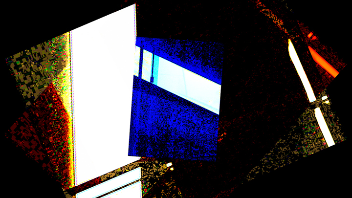
The personal challenge was to use the same clip of roughly 3 minutes of footage involving TV snow as filmed by a Canon VC-50 Pro saticon tube camera and fed through three mixers of which the fist two (a pair of Sony SEG-1 and 1A units) lacked horizontal & vertical sync. (That is, the looped signals were cross-faded and were not genlocked, hence the rolling, scrolling vertical & horizontal bars.) The third mixer was a currently out of commission Panasonic WJ-MX12, and the recording media was miniDV. Assembly, layering, and editing was done in Adobe Premiere, with After Effects used for the rotations and zoom-ins / outs.
The first sequence – intro narration and music from Holbert’s The Walking Wounded – is a blend of overlapping footage layered, coloured, squished and timed for specific instrumental appearances (piano, for example) before folding back into the slimmer intro section and fading out in sync with the music.


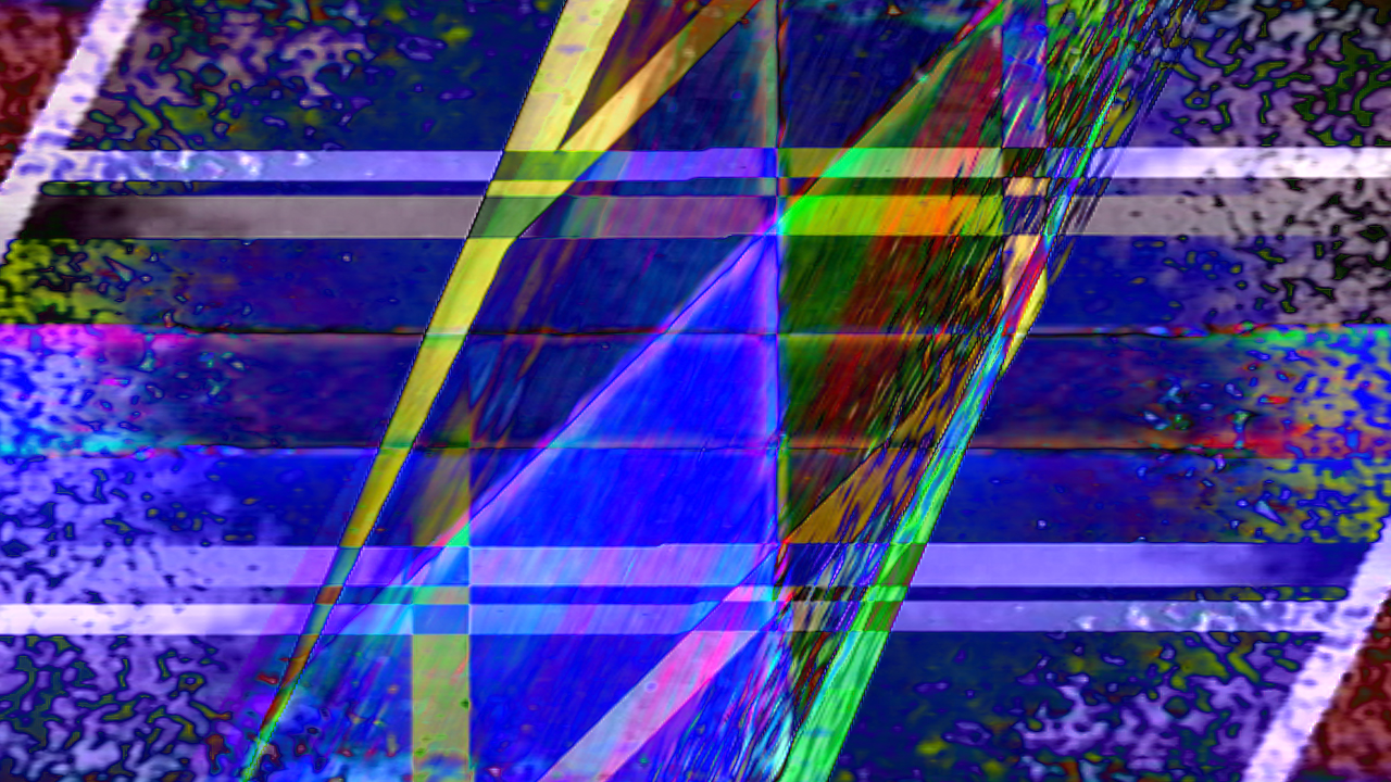
The second sequence is just music, so I could go a little crazier with the images. Because the cue extract is from the grindhouse-styled shocker Hobo with a Shotgun and is an overt action cue, I treated the footage differently, punctuating bass hits with simple colour changes before layering some of the moments when the non-genlocked footage intersected.

If you feed two video signals into a mixer without any sync, the images move of their own volition, establishing their own rhythm which can be tweaked if you change the levels of the video signal. The two chunks that accompany the choral sections of the cue are from that footage with altered colour, whereas the finale of the segment is a series of canted versions of the original footage, each with different colour shading. The idea was to evoke flashing neon panels of geometric shapes, and make them resemble something from a sixties magazine ad – like a fabric or wallpaper pattern.


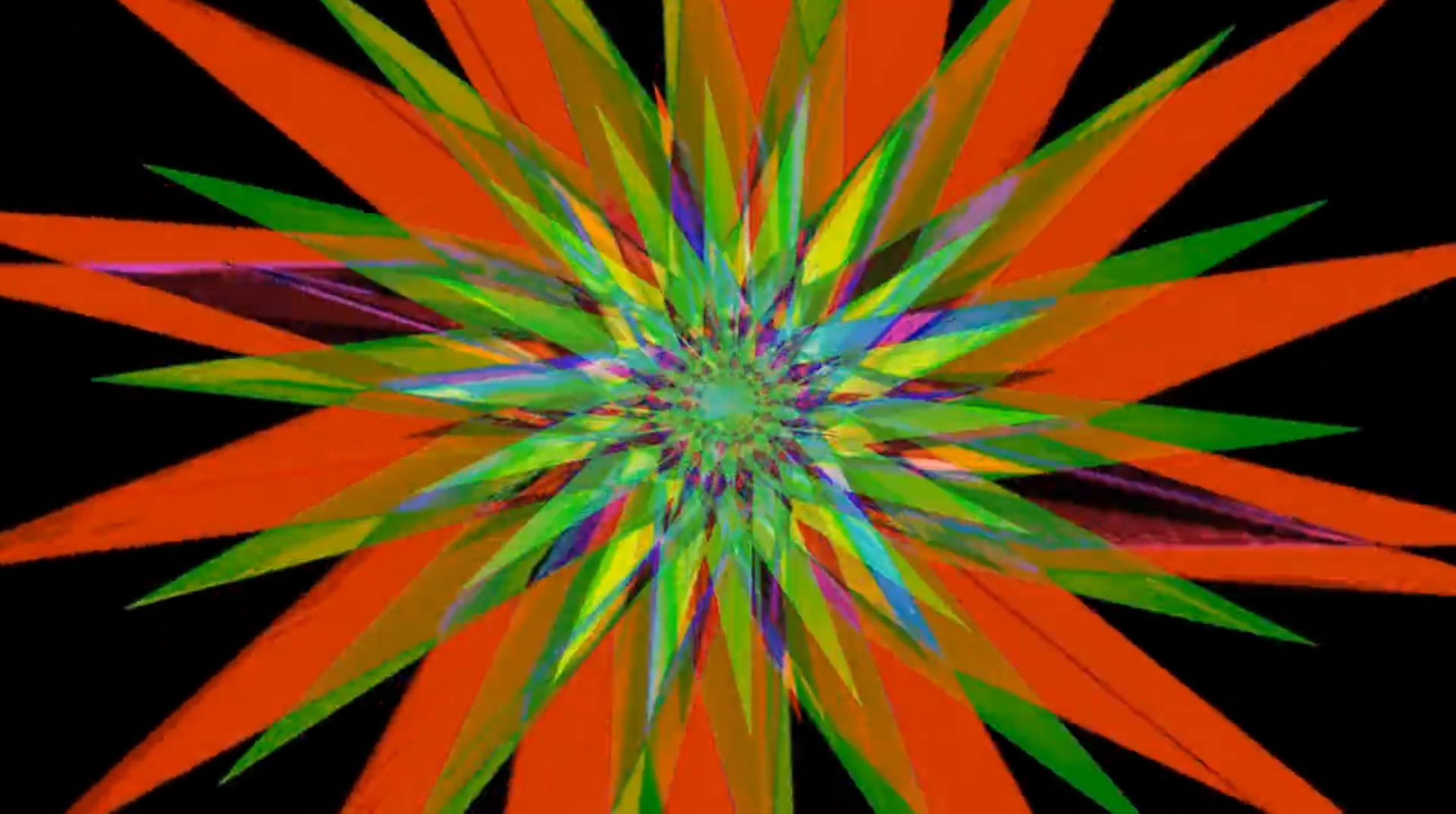
The third and final idea for Holbert’s Oh, the Places You’ll Go! started out much differently. The original idea looked like this, with flinching movements


But its mood was too abstract, and the colours were wrong.
My original fleeting thought of the Seussian music was a flower, and that’s sort of what emerged as I messed around with the footage, folding it and moving it around like crystals before pinching them into flower petals. The final piece stems from decisions rooted in something creative, something time-sensitive (the podcast was originally positioned for a weekend upload), and just keeping it simple because ultimately it’s the music that’s the star. That said, this is probably the prettiest, nicest thing I’ve ever made, considering the prior work sort of embraces analogue grunge.

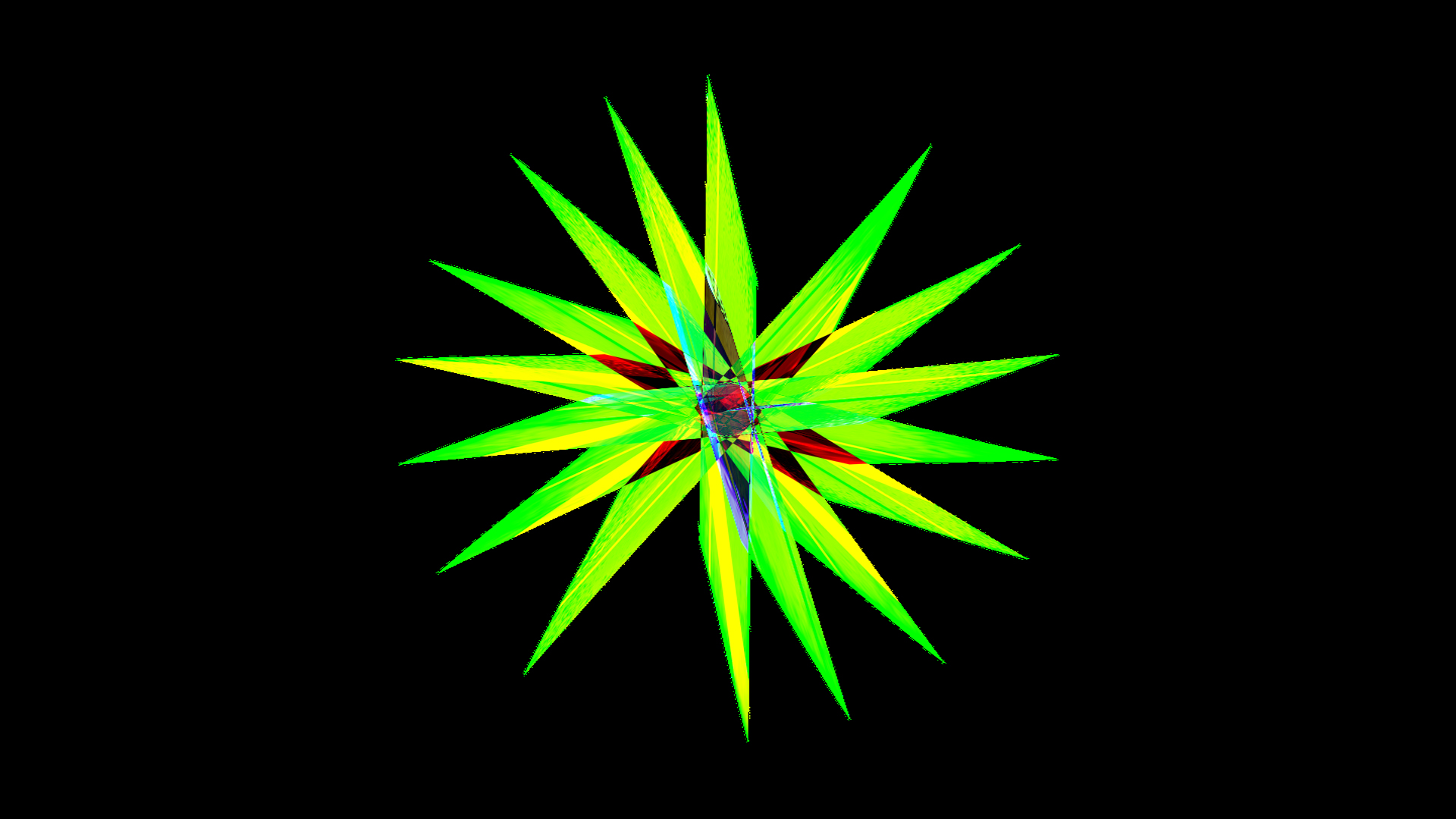

The benefit of working from analogue created footage are the nuances you don’t need to create digitally. Best examples: the flickering of each shape comes from the rolling sync patterns from the non-genlocked footage; and the electrified lines in the flower centre that snap outward inside the petals are the same sync lines severely crunched from the original square footage into individual flower petals.
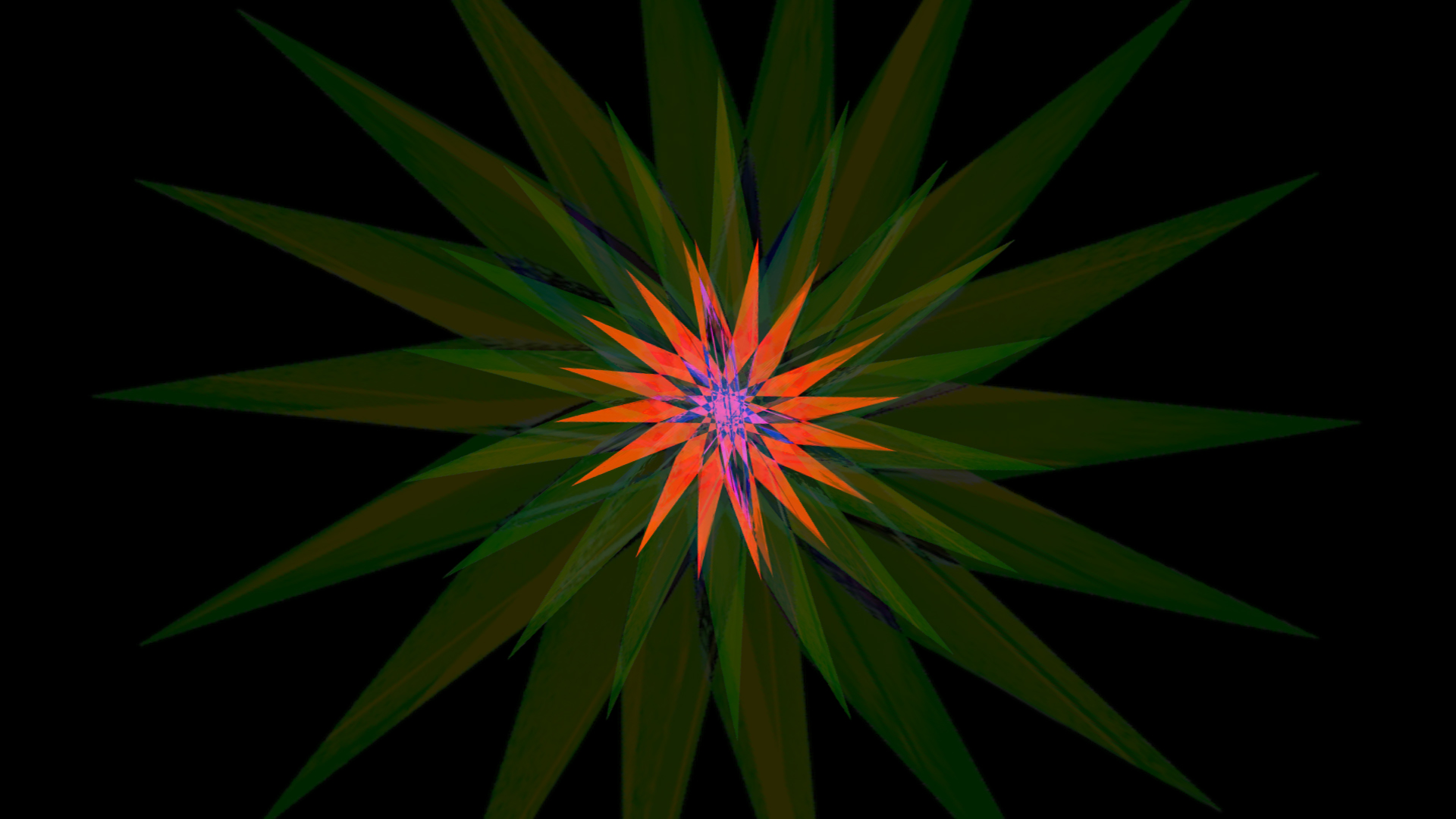
One problem with layering within Adobe Premiere is there’s a point where one layer causes a sustained mix of several images to pop out. For example, the point in the segment where the petals counter-rotate over each other.
As originally stacked in separate video tracks with different levels of opaqueness and filters, there’s a point were one too many filters and tracks creates a discontinuity: the image of rotating petals in red might suddenly go dark red with a lack of details because something introduced or changes recently made in settings (or shifting a track a little) buggered things up.
The trick is you create one movement that works – say the red petal – and turn it into a nested sequence. If you highlight the tracks of the first movement and right click and selected nest sequence, it’ll essentially flatten the tracks into one. (If you double-click on the ‘nested’ single track, the full tracks reappear in a separate sequence in the timeline area where you can do changes.)
I did this with all three movements so I could add dissolve points; as single tracks, this is easily possible, but had I not created nested sequences for each of the three, not only would the video tracks spread into the twenties, but none of the dissolves would’ve worked.
Lastly, returning to the issue of compression and loss of detail (if you’ve read this far, it’s because you have indeed followed my advice and watched segments first), here are three stills comparing the flower petals from the original project in 1080p, and (roughly) the same shot from YouTube and Vimeo after each knocked down a high bit rate 720p file to their respective converted 720p versions:


It’s not too difficult to see how much is lost when greater compression is applied to the crystal-like centre of the flower. Those details are kind of important, and I find it’s still a hit-and-miss process in finding the right combination of settings that fully render those 3 minutes without flaws in 1080p.
As for the podcast audio, it was all edited, filtered, and mixed in Sony’s Sound Forge. This was an especially challenging recording because 1) phone audio is inherently flat, dry, and sometimes muddy, and any added flaws can add hours of clean-up time; 2) there were sections when voices were not always close to the phone, which required rebuilding the volume, knocking down hot spots, creating a neutral hiss track, and filtering a few time sin between so what emerges isn’t muddy, hissy, or unintelligible.
Phone audio is never pretty, but a big benefit is when there’s no waning cellphone connection that can cause a voice to degenerate into audio blubs. There’s no way you can extract coherent words from globs of sound, and there are times when the only choice is to drop a response because the signal degenerated at one point beyond intelligibility (which can happen when a cellphone connection is used, even in a Skype conversation).
The final results of the voice stems are acceptable now, but you’ll notice spots where there’s hiss that couldn’t be further minimized.
I’ll have another short making-of blog for my upcoming podcast with Rewind This! director Josh Johnson, but for those who bothered to get this far, here’s where childhood dinners come into play as influences.
Before my mother switched to easy-to-wipe vinyl-coated dinner placemats, we had two specific varieties: one was white with a 1/3 of the mat coloured matte yellow, green, or blue, and the kind of abstract thick-tipped drawings of wine glasses, plates, bowls, knives, and forks that were used on jazz LPs. The other type of placemat was a deep red one with coarse black streaks from top to bottom.
I spent more than 10 years looking at these designs while waiting for the food to come, eating dinners, spilling milk like a klutz, and waiting for dessert, so my guess is my interest in abstract, geo-styled pattered stem from the hours each day eating on top of those still-striking placemats.
Cheers,
Mark R. Hasan, Editor
Big Head Amusements